
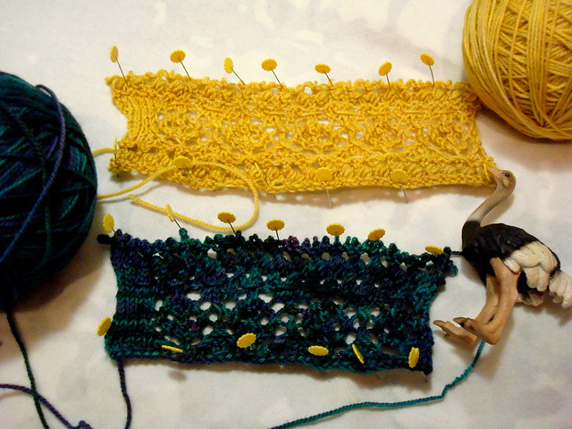
Both are similar (and using the same stitch patterns), although the teal swatch I cast on fewer stitches, and then I wasn't sure what I thought about the colour variations- if they distracted too much from the design. So I cast on in Gold, for a more tonal take on things.Then I thought that what would really jazz this photo up would be to get an ostrich in there. You know, for kicks.
I'm leaning towards the gold- I think that (except on the white background) the stitches will be crisper, clearer. What do you guys think?
35 comments:
Ooh swatching, so exciting! I love the lemon-yellow one. :)
I agree...the gold is much crisper and the pattern is so clear. The dark is just muddled and would be a waste of all the work you put into it!
The stitches really pop with the yellow-gold swatch.
I also think that gold works better. Fantastic color!
I love that gold color (even if I can't wear it!)
I like the blue-teal better. But, alas, I am not impartial as I always like blues better than yellows. I will at least consent that perhaps the lace will look nicer in a solid yarn than in a variegated one.
I love the stitch definition of the gold one, AND that color looks great on me! So yes, gold!
I agree: the gold swatch lets you focus on the stitches.
This looks to be a lovely pattern. Looking forward to seeing what you do with it.
I definitely prefer the blue yarn, but for the stitch pattern, the yellow is much better. The variegation in the blue interferes with the visibility of the pattern.
I like the gold. It pops.
Both are lovely but the gold is lovelier :-)
I like the yellow better. For the stitch definition, for the lack of distracting variegations and for the great cheerful spring color! Yellow always makes me happy (and it's THE color to be this year, according to the magazines!).
Go for the gold!
You can't see the stitches as well in dark green yarn...
First the ostrich DOES make the picture ;)
And I'm going with the masses, the gold looks beautiful.
ohh exciting, I want to know more!! I think the gold will photograph better as well.
While I am not a yellow fan in general, the light, solid yarn shows off your pattern much better! Good luck fitting in one more design!
I usually go for blue, but the yellow really pops in this swatch
They're both nice, but the ostrich is my favorite. ;^)
I like the gold and the ostrich!
Ooh I can't wait to see what's up your sleeve ^_^
I love the clarity of the gold swatch. The dark one is beautiful, but the color variations do distract from the details.
i agree that the stitches show better on the gold. that being said, i hope you'll tell us what that gorgeous blue-teal yarn is, and also show us what you decide to make w/ that! :) also, i love the ostrich...is that a corner gas reference? :)
I'm also going for the gold, the lace looks more delicate and defined.
haha love the ostrich too!
I too really like the gold swatch!
I lean toward teals but my vote is for the yellow in this pattern. The pattern is beautiful!
Yup - you're right, the gold helps show off the stitch better.
Hmmm, I don't disagree with everyone who chose the gold but somehow that teal is so stunning, I found myself looking at it for longer. Either one, your swatch is coming along beautifully.
Gold as most people wrote, thought yellow is my favorite color... and the stitch definition is nicer there.
I love the teal as well, but not for this project.
Gold, without a doubt though love the other one for a different item.
I am drawn to the gold. The design can be seen much better. I do like the teal fiber but maybe for something else.
I love the good colour. Ideal for the summer!
Definitely the solid color. Any intricate patterns get lost when variegated color is involved IMO.
When you swatch, do you block without casting off and cutting from the ball?
I agree. The gold will probably allow for better stitch definition. Hello, Mr. Ostrich!
I say go for the gold! I like yellow in general anyway, but in this case, I think it looks better because I think variegated colors look best in simpler stitch patterns.
Yes, I would say gold would give you a clearer stitch pattern.
Love the ostrich.
Post a Comment