
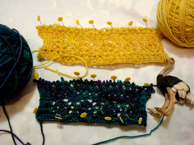
Both are similar (and using the same stitch patterns), although the teal swatch I cast on fewer stitches, and then I wasn't sure what I thought about the colour variations- if they distracted too much from the design. So I cast on in Gold, for a more tonal take on things.Then I thought that what would really jazz this photo up would be to get an ostrich in there. You know, for kicks.
I'm leaning towards the gold- I think that (except on the white background) the stitches will be crisper, clearer. What do you guys think?