I knew that if I asked my fellow knitters out there, you'd have awesome solutions to the problem of the rose armwarmers! I was absolutely bowled over by all the awesome suggestions, links to patterns with similar charts, etc. I can see now that I'll probably have to do some swatching with the colourwork charts, to see what will work- a big chart can only be scaled down so much when using fingering weight. I'm so excited to start them in the fall! As soon as I come back form England in September, I'm going to get started on them right away.
So. remember when
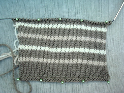
I
was trying to decide on the colourway for my Agathe pullover? And
you all got to vote? Well, the yarn arrived, and I've
swatched! I don't think like it. Well, it's okay. Maybe it'll grow on me?
I got another colour, just in case:
what do you
think?


34 comments:
I like the first swatch. The stripes in the second are too close together, and they seem to disappear.
I like the second one better, though I understand what RecoveringActor is saying. I just don't think "disappearing" stripes are necessarily bad :)
I like the 2nd one MUCH better! The monochromatic color palette is really pretty.
what about trying a swatch with the blue & the lighter (I think white) of the 2 other contrast colors? I think I might like that better than either of the ones you've already tried.
I vote for the second swatch. Hands down. I think you'd wear it more.
Nobody loves blue more then I do, but I think that the second colour combo is more subtle, pretty and wearable. I'm going to scan and e-mail you the rose charts I offered up later today!
I think my opinion is irrelevant. If the sweater is for you, and you don't like it with the blue, then for the love of whatever, don't go with the blue. Sure, it *might* grow on you, but it's just as likely that it won't, and you'll end up with a sweater you don't care for. Don't risk it.
I absolutely LOVE the second one. It's so subtle and pretty. The first is nice, too, but I feel like the blue needs to be either darker or lighter.
I like the second one best, but then I never met a shade of grey I didn't love. You should make what YOU like best.
Boring! I always tell my students not to knit something if it looks like you can buy it for $20 at target. Put some color in there!
I definitely don't dislike your first swatch; however, the second is GORGEOUS! It's all personal preference though! Can't wait to see what you decide!
ooooo i like the first swatch a lot, but the second one is by far my fave. it's so pretty... it reminds me more of you than the first :)
So, I voted for a combo with the blue before, but of these two, I like the second one better. Guess that's why we swatch ;-)
I vote for swatch #2... the subtle variation is gorgeous!
I agree that swatch number two is my preferred choice. I like the slight tonal variation.
I like the second one better... I'm not so hot for the blue... I feel like it's out of place. Good luck :)
I prefer the second one, but I agree with the comments that the second one is probably more wearable in the long run. Great choices!
I can't wait to see what you come up with for the armwarmers. And I like the second swatch better.
I like the second one better =)
It's gonna be gorgeous!
I like the 2nd swatch much better, too. That's my pick for sure.
I see what you mean about the colours, but I do think either of the swatches will make a great sweater.
If you have doubts in the beginning it will just become worse as you go along. Maybe try the blue and white and see what those two colors look like together. Go with what your guts says; the most important thing is that you will see yourself wearing it in the future.
Both swatches are lovely but I do prefer the 2nd one. It seems that you might wear these colors more.
I like the subtle qualities of the second swatch. However, if you want the sweater to have a bit of pop like the original, what about an orange-y color? In the Nordique that would be Spicy Rose or Carrot. I think the dark and light grays with Carrot would look lovely.
I actually think the problem with the first swatch is the white and blue are competing. You might want to try a swatch with just the blue and grays and see what you think.
I vote for number 2, the subtlety is so pretty
i too like the 2nd swatch, it's softer contrast, and it's very lovely :)
I agree w/ The Sweatshop of Love. I think it needs another contrasting color. What happened to the darker brown? You could wear a burlap sack and look great Julie, but don't let it "grow" on you scrap it until you find the color combo that will make you love it!
I'm looking forward to seeing your Rose Armwarmers, but I'm sure they will be beyond gorgeous just like everything that you knit.
I love the second swatch. But the first one with those blue stripes will give the sweater a more whimsical feel and accentuate your small legendary waist. That's my two cent. The final decision is yours...hee hee hee
I'd try out Kim's idea (4th comment), the blue and the brighter white would be more of an equals than the blue with the off-white.
You probably have bigger amount of the brown yarn than the blue and the whites so choosing other prime colour from the blue or either of the whites probably won't help...
But if not then you can play with them to find the perfect match, since the colours are all gorgeous.
I (as everyone else here) have fate in you. ;o)
I'm so glad you have more information about the rose armwarmers. Hooray for knitters coming to the rescue!
I like Kim's suggestion of swatching with the blue and your alternate for contrast stripes. That way, both colors would pop.
I'd go with the second one. the first one is too bright, I think.
I like the second one better. I think it's because it's lighter.
I also like the second sample LM
I much much like the blue! Blue flowers (esp. roses) seem so wistful. :-)
Post a Comment